
If you attach an Excel spreadsheet when creating a presentation with Copilot, you can generate a PowerPoint presentation from the data.
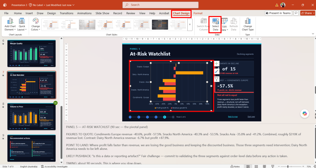
Copilot can create charts based on the spreadsheet and insert them into PowerPoint as editable charts rather than static images. It can also build the presentation structure, add navigation between slides, create speaker notes, include transitions and animations, and generate recommendations based on the information in the workbook.
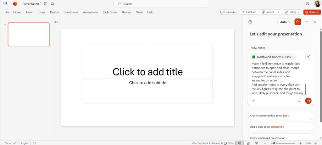
Here’s an example of prompt you can use to turn raw data into an dashboard presentation, complete with charts, KPI cards, animation, and speaker notes. Run the prompt in Copilot in PowerPoint using Edit mode.
Build an interactive dashboard walkthrough from the attached spreadsheet [attach Excel file] for [audience/purpose].
Structure it as a guided tour: a title slide with the headline numbers, a clickable map of the panels, then one panel per metric: [list what data you want to focus on, e.g. overall KPIs, revenue by channel, top-performing campaigns, engagement quality, and campaigns that are losing money]. Then close on recommended actions. Hyperlink the map into each panel and add a link back to the start.
Give every panel its own chart drawn from the real data, plus a short callout that says what the chart actually means rather than restating it.  Insert charts as editable PowerPoint chart objects, not static images. Include things such as warning colors for the at-risk items, KPI tiles, and a step tracker showing progress through the tour.
Make it feel immersive to watch: fade transitions to open and close, morph between the panel slides, and staggered build-ins so content assembles on screen.
Add speaker notes to every slide with the key figures to quote, the point to land, likely pushback, and rough timing.
The data comes across with the chart, allowing you to modify the chart type, formatting and values directly in PowerPoint. The more specific your instructions are, the better the results tend to be. Include details about the audience, the sections you want covered, the type of analysis to focus on, the visual style and any presentation techniques you want included.
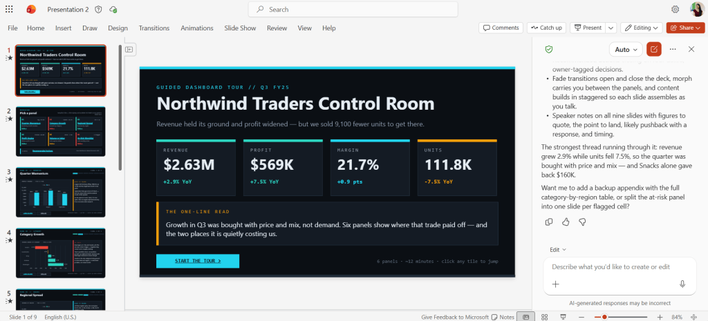
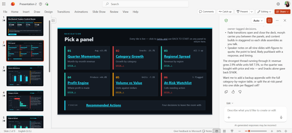
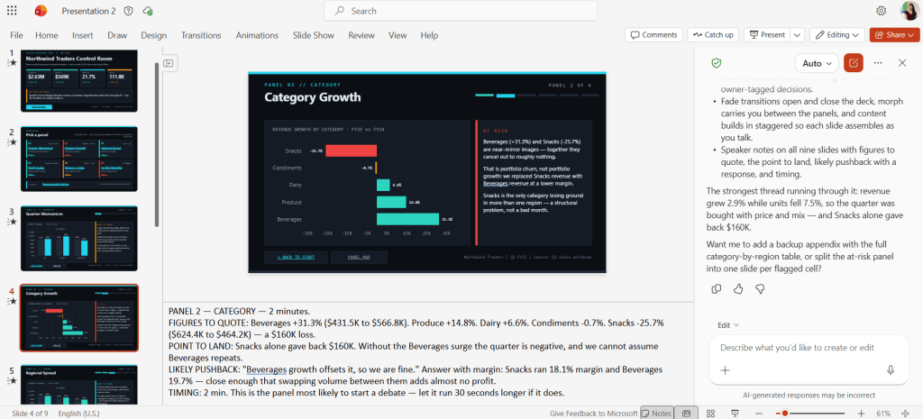
After the presentation is generated, take time to validate the output. Review the charts, compare them with the source workbook and confirm that the analysis has been represented correctly.
Click on the chart, then in the ribbon select Chart Design > Select Data and validate the figures against the original spreadsheet.